One of the things I love about being a data analyst is the breadth of the skillset required. My neurospicy brain loves to learn new things and make connections. While exploring, I often stumble across concepts that can be applied to my work. Discovering colour theory while doing an art course is an example that I’ll run through here.
I’ll take you through a basic explanation of colour theory, how it can be applied to data visualisation, and how you can use it to build an effective colour palette of your own.
What is colour theory?
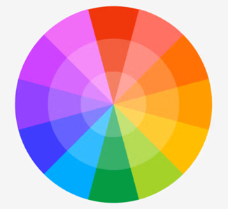
Music theory describes the patterns behind which sound frequencies “work” together: the cycle of fifths, counterpoint, harmony and so on. Colour theory does much the same for colour. Both can be described mathematically, but I won’t go down that rabbit hole here1, except to mention that Sir Isaac Newton developed the first colour wheel in 1666, as part of his work on optics.
The colour wheel is based on the primary colours – red, yellow and blue – generally shown in a wheel with a segment for each tertiary colour, forming a kind of circular rainbow doohickey, as shown below:
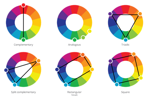
Colours on opposite sides of the wheel are described as complementary, giving the classic, contrasting combinations of red and green, yellow and purple and – the data viz favourite – blue and orange. Other harmonic colour combinations are shown in the image below:
There are other elements to colour theory, such as saturation and lightness, but we’ll leave them for now and touch on them in the final section where we look at building our own palette.
How does this apply to data visualisation?
By using Gestalt principles to give meaning to the colours that our audience will intuitively grasp, as outlined below. This reduces cognitive load and comprehension time – two of the key aims of good data visualisation.
Complementary colours can be used to visualize contrast.
The most effective – and, happily, the most used – combination is blue and orange. The use of red and green is problematic because they look pretty much identical to people with the two most common forms of colour blindness (about 1 in 20 people). Purple and yellow is also not ideal as yellow gets lost against a white background. This is an effect of another aspect of colour theory, colour context, which is also an important consideration for accessibility.
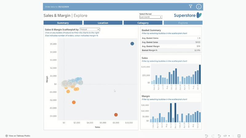
Another advantage is that we process orange/red as ‘dangerous’ and green/blue as ‘safe’. This makes it ideal as a solution to not only communicate the contrast of, say, positive and negative margin, but also to convey – for example – that negative margin is bad. M’kay?

The dashboard shown below is part of an example Sales & Margin report in my portfolio (here – go to the “Explore” tab). Without having to look at the axes or a key, it should be clear that the angry, orange blob at the bottom of the scatter plot is Bad News. The hope is that someone of curious mind2 will hover over it to see a product that made a substantial negative margin last month, then click to see more detail in the charts and table to the right to get more details.
Analagous colours can be used to express similarity, while a split complementary scheme can show two similar dimensions against one that is dissimilar.
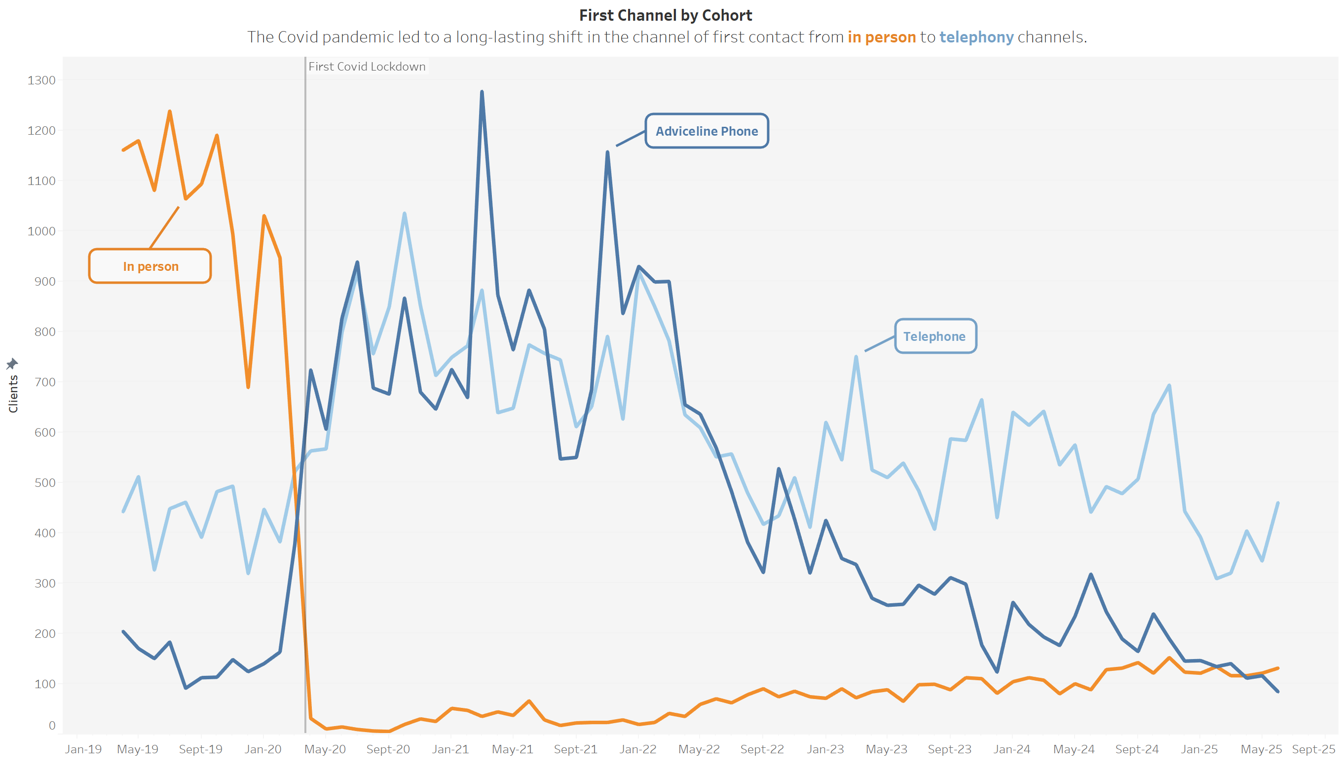
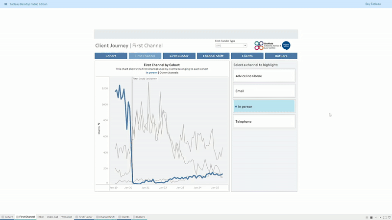
The example below shows channel of first contact over time with a vertical line to mark the start of the first Covid-19 lockdown in the UK. It uses a split complementary scheme to communicate the similarity of the two telephony channels, contrasted with in person.
Similarly, a rectangular colour scheme could be used to visualise difference between two sets of two similar dimensions, with two analagous colours juxtaposed against their complementaries.
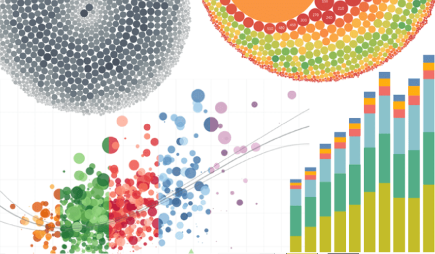
Triadic or square colour schemes can be used to express dimensions without implying similarity. I try to avoid using more than two distinct colours in a visualisation but the example below uses a square colour scheme to communicate the difference between the dimensions, but uses each colour individual as a highlight to avoid the overload of seeing all four colours at once.
I should point out here that I built some of the visualisations above before I’d even heard of colour theory. The fact that I did ok was in large part due to the tool I was using.
Hats off to Tableau!
I’ve always been a big fan of Tableau colour palettes but the more I learn about accessibility and design, the more impressed I’ve become. Some real thought, effort and care has been applied, making it very easy to apply good design principles without even needing to understand them. Looking back through my work, I’ve applied most of the above by accident, thanks to the work of Maureen Stone and Cristy Miller. You can read about their work refining the Tableau 10 colour palette here. Worth a read if you want to dive deeper.
I guess the takeaway is that you probably don’t need to think about colour too much if Tableau is your weapon of choice. If you’re using Power BI, or building your own visualisations with Python or Javascipt libraries, it probably bears some thought.
Creating your own colour palette
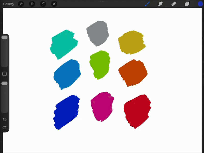
I’ll walk you through the process I used to create a palette to harmonise with my logo. I used Procreate on my iPad because I love their colour options. The first step was to use the Harmony tab in the Colours menu to find colours that harmonise with the blue in my logo. (The orange in my logo is already the complementary colour). As you can see, it took – literally – a minute.

Other art/graphics/design software will have similar options but – of those I’ve tried – I’ve found Procreate to be the most straightforward. In GIMP, for example, you only get triadic values, so some ‘eyeballing’ is necessary. I’m sure there’s something great in the Adobe suite but my budget doesn’t stretch that far!
The resulting colours harmonise well but they do have the same “Crayola bright” look as the original Tableau 10 palette, which can look a little “shouty” in a chart. I don’t have the competence, time or tools to do anything as sophisticated as Maureen Stone & Cristy Miller’s revision of that palette, but dialling the saturation down to 35% gave me something I was happy with. The result still harmonises well with my logo, but looks a bit more “grown up”. You could also try tweaking brightness here but I’d avoid altering hue, as you’ll lose the connection with the base colour.
If I were being super picky, I might dial up the saturation and/or brightness of the complementary orange by a fraction, and do the opposite for the darker analagous blue. I may revisit that one day but I’m a data analyst, not a designer, and there’s a time to stop polishing and move on! The final step was to find the hex values for the colours in this palette using the ‘Value’ tab in the colour tool.
I’ve since imported the palette into Tableau, and I’ve created a quick tutorial to show you how. If you’re a Power BI user, you can achieve the same by creating a custom theme. If you’re using Matplotlib or D3, you know what to do without my help!
Before I sign off, I’m completely new to this – this is my first blog of any sort – and I’d very much value feedback to help me improve. There’s a comment box below, or you could use the main contact form (that I’ll hopefully have set up by the time I publish this!)
Footnotes in my blog are for rabbit holes
1 You can dip your toe into the mathematics of colour theory here.
2 In reality, almost no one will explore interactive data visualisations. I wish I understood why, or how to turn that around, but the hard truth is that you need to tease out the narratives yourself and deliver them in storytelling format. That said, for those who do like to explore a chewy, interactive viz, Tanya Lomskaya is an absolute master. I can easily lose an hour exploring a viz like this one.